Has Figma been ultimate remote working solution?
Whilst memories of the height of the pandemic may be fading, there's no doubt we've all been through it the last couple of years.
I’m three vaccine jabs down, left, right, left, all leaving me feeling more like a featherweight boxer on the ropes than a Lead Experience Designer and at the time of writing this, I’m back working upstairs from my son’s bedroom during a period of isolation and I’m asking myself, what has the experience of using Figma throughout periods of remote working taught me? Has Figma been the cure for designers around the world to successfully work together remotely?
Well, like with any good digital product, once you’ve used one for a while, new ways of doing things start to become so familiar you forget what it was like trying to cope without all the extra functionalities. The experience of using a new digital tool can be so positive that you end up asking yourself how on earth did I get by without it?
This is exactly how I felt when I first transitioned to Figma and leads me to my first point, which is how Figma improves collaboration. I couldn’t give this review without touching upon the first time I co-designed in real-time with another designer based in London (but due to Figma being a cloud-based application we could have been anywhere in the world at the time). I experienced that day, both our mouse cursors furiously designing in tandem within the same Figma artboard ( mind = blown 🤯.)
In hindsight, this now doesn’t sound all that mind-blowing, but at the time it felt like the holy grail of design collaboration and what we all needed as a department but could never have imagined only a few light-years ago. This simple ‘multiplayer’ editing functionality has moved our team’s collaboration forward exponentially and feels like a long way from the days of designing UI ‘PC’ (pre-COVID) - what, I like to describe now as the new BC.
What I was most impressed with, along with the multiple users in one file, was how quick Figma was as an application even though we had multiple artboards and designs that included lots of rich imagery. I think I was pre-programmed to think the experience would lag and many minutes would be wasted watching a spinning wheel of death (If you know, you know), but this just wasn’t the case. Figma’s UI feels light to the touch and rapid to design in — a real shot in the arm!
Having this shared access to a file resulted in remote design reviews with multiple team members (all working from home). Each member of the team was able to come into the same design file and by selecting my avatar, they could follow my cursor, as I presented designs back. This is a cool feature and a real advantage compared to the tools we were using before working remotely.
Figma’s commenting functionality allows the different disciplines within the agency to comment on areas of the design in real-time or at any time. Although, as a designer, allowing multiple people access to your design file is something that will always take a little getting used to. I will always have that anxious feeling each time another non-designer cursor enters the Figma file and hovers around the design you’re working on! Bringing a whole new meaning to the much-loved agency phrase “Hovering Art Directors”

Figma has introduced other ways to improve collaboration. A less formal cursor chat was introduced at the tail end of 2022, a lovely new feature that adds some of Figma’s playful brand personality into the UI and makes chatting informal when working alongside other UI/UX Designers or Developers. There is also the audio chat functionality (if you’re not already on a Teams call at the time), which again makes being able to communicate with a team member easy to do within the application.
Digital style guides for digital products
‘Design Systems’, a bit like ‘Furlough’, felt like it was just the buzzword of the last 24 months, but a well-crafted and organised Design System can massively improve efficiency, saving time and money over the lifespan of a product and ultimately will improve the consistency of the design within your product team. This has been even more prevalent when we have all been working remotely for the last two years.
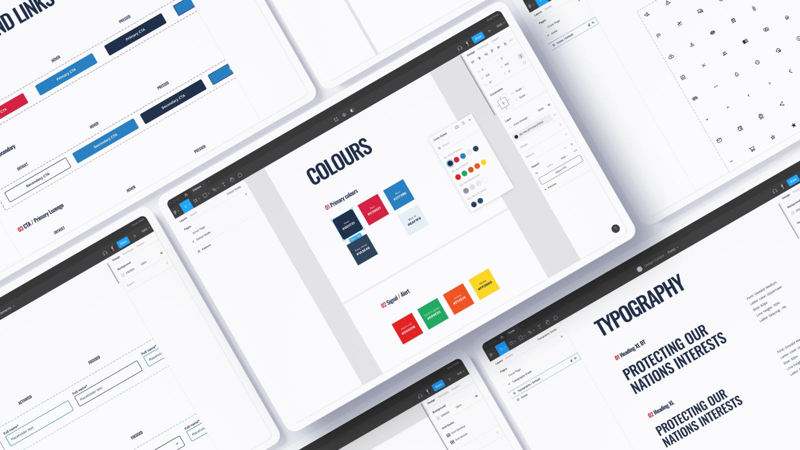
Wondering what a Design System actually is? Think of it as a digital style guide for a digital product that will include styles for everything from atomic elements, such as colour, typography and buttons, all the way up to responsive components and motion guidelines. As we move towards a more product-based approach at Great State, the benefits Figma brings to me and the wider team are nothing short of amazing and a huge leap forward. We can structure and organise a Design System in Figma that all team members can contribute to and feel a part of, and that acts as the one source of truth for everyone.
With only a small amount of onboarding, we have been able to set up Design Systems within Figma so it is clear for anyone accessing files, where they can find what they are looking for. We have structured each key chapter of a Design System into their own shared library, making it easier to manage and update. That means kissing goodbye to questions like “where is the latest version of the design saved?” or ‘what is the correct colour value for the Orange?.” I particularly like this about Figma, as it makes for a much cleaner UI design workflow and with auto-save and version control built-in there are no more issues around not knowing if “client-name-homepage-v7-Final-Final-v2” is the latest version of the design file!

Make friends with Auto-Layout
I can’t talk about Figma without mentioning “Auto-Layout” which is a fantastic, unique design feature that blends the challenge of bringing design and development together. For designers, Auto-Layout enables us to design once to create fluid responsive UI components that can quickly be edited to use across different breakpoints, saving time (and money) by speeding up our design workflow.
However, understanding Auto-Layout and its little nuisances may take a little getting used to. Of course, avoiding using this feature doesn’t make you a bad designer, but my advice would be to try and become a Jedi Master of Auto-Layout as the long-term benefits this will have on creating components for your Design System will be well worth it.
Bringing UI to life
My final point is about being able to bring designs to life within Figma. This has been great for quickly prototyping user flows, interactions or transitions, without the need to transfer the designs into another application, something I’ve always found to be a bit of a barrier to the workflow.
The advantage of Figma having animation capabilities built-in means we can now quickly transition within the same design file to start bringing UI to life without having to touch any code. Your developers will also like you, as the animations can be viewed in CSS code, which helps with your hand-off to them, especially when you want to tweak those Bézier curves in the browser! Sharing animated prototypes for review can easily be accessed via a shared URL link and designs can also be viewed live on a mobile device using Figma’s Mirror app, which works like a dream.
However, it’s worth mentioning here that if your requirement was for some more ambitious or complex animations, you may still want to use another application such as Principle or Adobe After Effects to reach a higher level of animation fidelity.
To wrap up this little review…
In an industry where the tools we use change all the time, my feeling is that Figma has created a modern UI tool that has been designed from the ground up with real-time collaboration at the heart of the overall experience. In my opinion, Figma is a UI tool that we may not have survived the pandemic working from home without. And as we transition to working together back in the studio, we are now armed with a tool that will help us deliver better digital products and experiences.
If you have any questions about Figma, Design Systems or how to master Auto-Layout feel free to reach out to me and I will try my best to help any young digital design padawans with any questions about the ways of the (Figma) Force.
It’s worth noting that this review was written before 20th Jan 2022 when on this day a bug occurred within Figma stopping overrides from being preserved when a library was pushed. This was a very painful experience at the time for the whole Figma community, but credit to the team at Figma who jumped on this straight away to ensure the bug was resolved quickly. If this is of interest to you, you can read more here.