
•05 Mar 2025
Accessible by design: building RHP's website
•15 Dec 2025•6 mins read
Accessibility isn’t a checkbox; it’s good design, done right. Aimee, our Software Engineer at Great State, is the code wrangler behind RHP’s new digital platform. Together with a cross-functional team spanning strategy, UX, and creative, she’s had the pleasure of bringing the thinking to life, building RHP’s new digital experience.
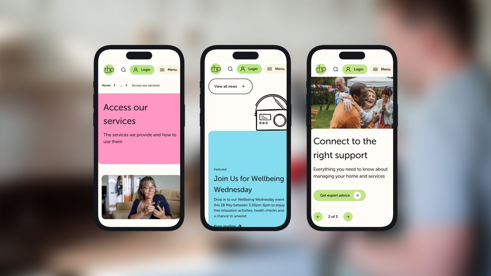
The site serves more than 11,000 residents in South West London who are managing their homes, many of whom visit during moments of stress or urgency to pay rent, report repairs, or access support. The challenge? Make the platform intuitive, reliable, and inclusive for everyone, while ensuring users could get what they needed quickly and get back to their day.
Take it away, Aimee, and tell us all about the process behind crafting something that actually benefits its users on a day to day basis.
Why accessibility matters
For me, accessibility isn’t just a set of rules – it’s empathy in action, expressed in HTML, CSS, and just the right drop of JavaScript. Whether someone’s navigating with a screen reader, viewing a webpage on mobile, or trying to jab their way through forms like a speed runner, I want the experience to feel smooth, intuitive, and delightful.
In short, my mission is clear: build a site that works for its users, with no excuses.
However, the WebAIM Million 2025 report paints a stark picture: the average homepage contains 51 accessibility errors, and more than 96% of the world’s top one million web pages are not accessible. By overlooking accessibility needs, organisations risk excluding 16% of the global population, which equates to around 1.3 billion people. It’s a clear reminder of how essential accessibility compliance is, not only to meet standards but to avoid shutting out a significant portion of potential users.
These aren’t obscure edge cases; they’re fundamentals like missing alt text or poor colour contrast. Many teams know accessibility is important but don’t know where to start. Or they assume it requires specialist skills and endless hours of resources.
For RHP, accessibility was central to their brief. This project became more than a technical rebuild – it was an opportunity to reimagine the digital experience, build trust, and empower residents to self-serve confidently. As some users accessing the website had low digital literacy or limited English, user journeys had to be clear and well-signposted.
Collaboration first
Accessibility isn’t a developer-only problem. It requires collaboration across the entire project team. From clear acceptance criteria set by the business’ analysts to rigorous testing by Quality Assurance, and ongoing awareness from content editors when adding elements.
Plus, designers consider colour contrasts, typefaces and motion from the start. This cross-functional approach makes technical implementation smoother and helps accessibility become part of the culture, not just a checklist.
Building accessibility: HTML, forms, and interactions
The foundation of RHP’s site is semantic HTML. We built the future-ready platform using the capabilities of Umbraco Heartcore, as this headless CMS provided us with flexibility, scalability, and full editorial control.
Instead of generic <div> elements, we used elements that accurately describe content: <header>, <nav>, <button>, <main>. These choices automatically provide keyboard navigation, screen reader support, and navigational landmarks, without extra development time.
Heading structures were clearly defined: the hero component always contains the <h1> at the top, with other sections using <h2> and nested <h3>/<h4> as needed. This ensures screen reader users can scan the page efficiently.
Keyboard accessibility was a priority. Native elements like <a>, <button>, and <input> handle this by default, while custom components used tabindex, focus styles, and ARIA roles to ensure all interactions were accessible. Tab order follows the DOM, avoiding CSS positioning tricks, focus leaks from modals, or off-screen navigation issues.
Forms are mission critical. Using Ark UI, a headless component library, allowed custom styling while keeping accessibility intact. Labels, fieldsets, legends, and help/error text are screen reader-friendly and visible, giving residents confidence to interact independently.
Images, motion and mobile
Umbraco Heartcore didn’t include alt text fields by default, so we extended the CMS, updated the front-end to consume them, and trained editors to use them consistently. Now screen readers, slow connections, and search engines all get the message.
Animation can add clarity or cause confusion. For RHP, we kept motion minimal and purposeful. Transitions highlight interactivity without being distracting, and anything that remains is user-triggered. This all added to a calmer experience and reduced unnecessary movement for the user.
Mobile accessibility was another focus. Touch targets meet the recommended 44x44 pixels, and we used invisible hit zones where smaller elements were required. Layouts use relative units, so text and components scale smoothly when zoomed up to 200%. Fixed positioning and horizontal scrolling were avoided, and zooming is never disabled, ensuring low vision users can comfortably navigate the site.
The result is a site that works reliably and clearly, whether you’re on desktop, tablet, or mobile. Every image, animation, and interaction was designed to be intuitive and accessible, without compromising the visual experience.
Results speak a thousand words
The effort paid off. RHP’s website achieved a high accessibility score, demonstrating the impact of deliberate, thoughtful implementation. Engagement metrics show the redesign is making a real difference:
- Help and advice engagement averaged 88.2%, 19.5% higher than the website average. This means users are finding content relevant and usable.
- Form submissions decreased by 60%, while file downloads rose 98%, showing residents are successfully self-serving.
- Exit rate in help and advice was 25%, indicating users leave after completing tasks, not due to frustration.
Beyond these numbers, accessibility improvements also brought cleaner code, better SEO, faster performance, and a site that’s easier to maintain.
Continuous improvement
Accessibility isn’t a finish line; it’s a mindset. Every improvement removes barriers, creating a digital experience that’s inclusive, efficient, and human-centered.
At RHP, accessibility isn’t an afterthought - it’s embedded in the design, development, and content process. It’s a commitment to residents, and one that will continue to evolve as the site grows and their needs change.
Looking to give your website or project the accessibility touch it deserves? Get in touch with us at hello@greatstate.co and we can begin mapping out your roadmap today.
Related articles
•04 Dec 2025
•22 Oct 2024